 The code is well-documented and organized

User interface design
Content
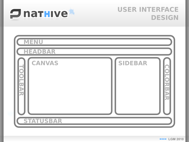
The interface design guide Nathive is clear (slide-2a), unique window, tabbed documents, try to avoid popups, and a well defined main window segmentation.
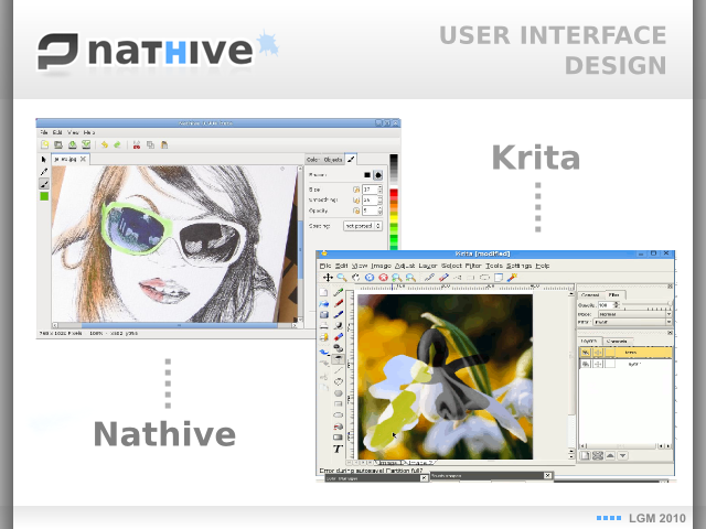
Menubar and headbar on the top, toolbar on the left, tabbed documents on the center, colorbar and sidebar on the right, this is very similar to other editors like Corel Photo-paint or Krita, (slide-2b *) but there are some point to highlight.
One of them is that the menus, headbar and toolbar are dinamically filled by plugins, (slide-2c), and only by plugin, this is because the plugin system it's a critical part of the application, I'll talk about this later.
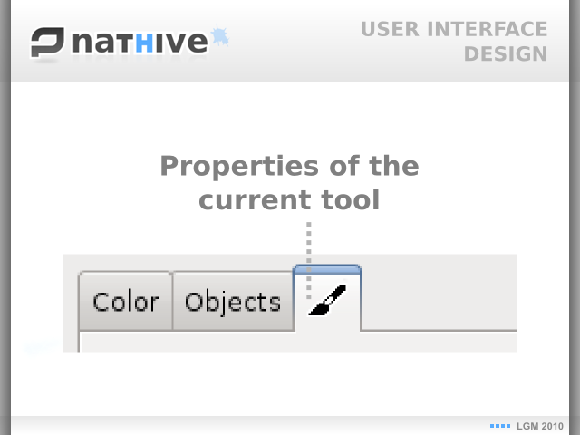
Other point is the sidebar (slide-2d), which contains three tabs, two are typical, color and layers, but the third it's a bit special, it displays the properties for the current working tool, this save a lot of space in the interface hiding useless options to the user. This is not something revolutionary, I know Krita has the same, but surely GNOME users will love it.
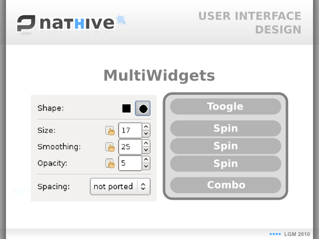
And the last point about the interface (slide-2e) is the unified system to display plugin properties both on sidebar (tool plugins) and on dialogs (other type of plugins), this is just an user interface abstraction layer to make easier the developers life.
* = Boudewijn (Krita dev) told me this is a 2003 Krita screenshot, was funny.